Themes
- Themes
Introduction
A theme is a Java class, running in the FWD client, which defines the look of the GUI:
- how the widgets are painted (window title bars and borders, buttons, toggle-boxes, radio-sets, fill-ins, combo-boxes, menus, scrollbars, browses, sliders, tab sets, tooltips, alert boxes, ...);
- the sizes the layout depends on (title bar height, border widths, scrollbar width, check-box size, menu paddings, ...);
- the default system colors (the Windows-like
COLOR_*palette) and the default fonts; - the images used by the widgets (caption buttons, check marks, arrows, cursors, ...).
Key facts:
- Themes apply to the GUI clients only (Swing and Web). ChUI is not themed.
- There is one theme per client session, chosen when the client starts. It can not be changed while the session runs.
- The 4GL
BGCOLOR,FGCOLORandFONTattributes hold an index into the 4GL color table or font table, not a color or a font. The theme never changes them: the 4GL code sets and reads the same index under every theme. Adraw*method usually gets only what the index stands for (the resolved color or font), but it receives the widget and can read the index too (see below). - What the screen actually shows follows the color and font tables wherever OpenEdge does; the parts which are not driven by these tables in OpenEdge are not driven by them in FWD either, and the theme decides how they look:
- Driven by the tables, when the 4GL sets
BGCOLOR,FGCOLORorFONT: the background and text of windows (client area), frames, fill-ins, editors, selection lists, combo-boxes, browses (also the column colors), text widgets, rectangles and the labels of toggle-boxes and radio-sets; the font of the widget text, button labels included. - Not driven by the tables: the button face and the button text color (buttons ignore
BGCOLORandFGCOLOR, as in OpenEdge); window title bars, borders and caption buttons; alert boxes; images such as check marks, radio buttons and arrows. Also, a widget for which the 4GL sets no color gets its colors from the theme's system colors (see "Colors"), not from the color table. - Where the table entries come from: the color table is a fixed default table (the 16 standard colors) plus the entries configured in the directory. The font table comes from the directory; the entries the directory does not define come from the theme (see "Fonts"). So a theme can change what font 3 looks like when the directory does not define it. It can also change a color table entry which the directory gives as a system color name (e.g.
COLOR-BTNFACE), when the directory does not define the system colors: these then come from the theme's default palette. - Using the tables is what the built-in themes do; FWD does not force it. A
draw*method gets the resolved colors (gc.bgColor,gc.fgColor, ..., with the table entries already applied) and the resolved font, but chooses itself what to paint with: it can use them, replace them with its own colors, or look up a table entry itself (gd.getBgColor(index),gd.getFgColor(index)).FwdEnhancedThemedoes this for the browse separators: it ignores theSEPARATOR-FGCOLORset in 4GL. Keep in mind that a theme which ignores the tables also hides the colors and fonts the 4GL program sets explicitly, so the application no longer looks like in OpenEdge.
- Driven by the tables, when the 4GL sets
- A custom theme is a Java subclass of a built-in theme, packaged in a jar and selected in the directory by its fully-qualified class name.
The built-in themes
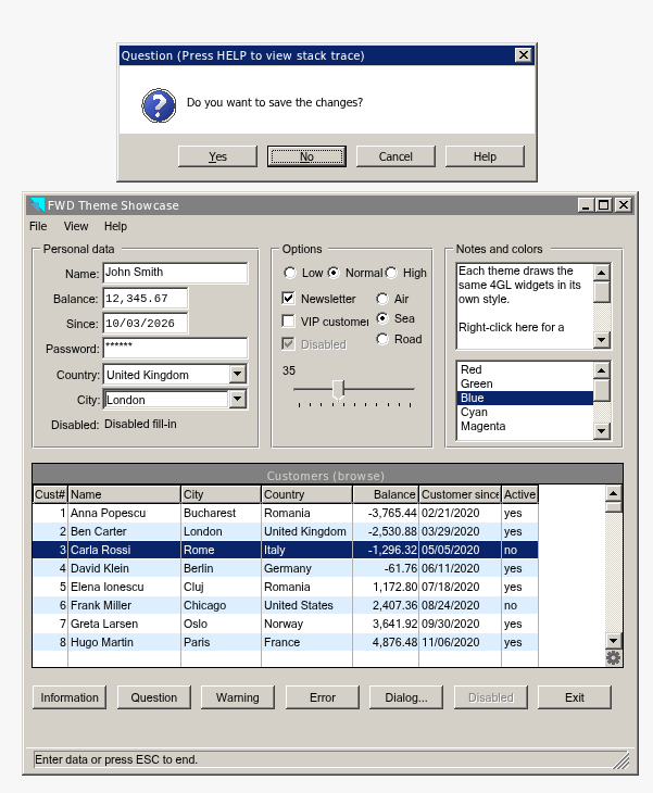
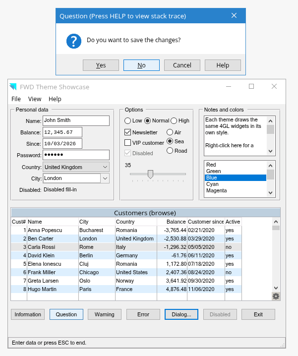
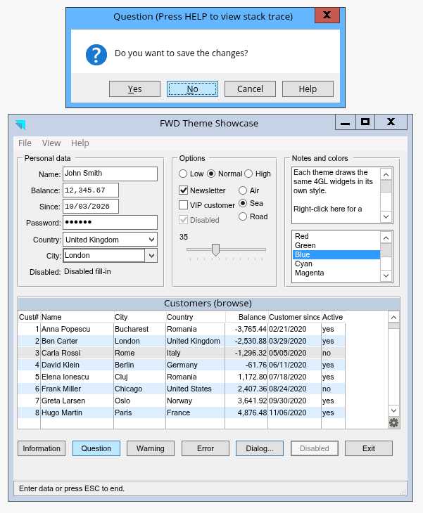
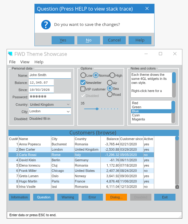
The screenshots show the same 4GL program, unchanged, run in the FWD Virtual Desktop with four of the built-in themes. In front of the main window there is a question alert box; the alert box is the active window, so the main window is drawn as inactive.
Classic (ClassicTheme): 3D borders on buttons, fill-ins, frames and scrollbars; the selected browse row uses the active title bar color (COLOR_ACTIVECAPTION, by default the same dark blue as COLOR_HIGHLIGHT).
Windows 10 (Windows10Theme, the default): flat widgets, blue title bar for the active window (the alert box) and white for the inactive one (the main window), thin caption buttons, light blue browse title.
Windows 8 (Windows8Theme): centered window title, boxed caption buttons (red close button), light blue window border.
Material (MaterialTheme), designed for the embedded web client: blue flat buttons, round radio buttons and scrollbar thumbs, thin solid slider track with a round thumb (the dots on the track are the tic marks, drawn only when TIC-MARKS is set), underlined fill-ins.
WindowsServer2012Theme and FwdEnhancedTheme look like Windows 10 (above); each changes only one detail, so they are not shown separately:
- Windows Server 2012 (
WindowsServer2012Theme): only the selection color (COLOR_HIGHLIGHT) is different: a lighter blue,#3399FFinstead of#0078D7(selected item in selection lists, selected text in fill-ins and editors; the browse selected row only witholdBrowseSelectionBar). The selected item of the combo-box drop-down list does not change: Windows 10 already draws it with a fixed#3399FF. - FWD Enhanced (
FwdEnhancedTheme): only the browse is different: the column label borders and the cell separators are dark gray (#737173) instead of light gray (#E7E3E7for the label borders,#C6C3C6for the separators). A separator color configured for the enhanced browse in the directory (separators_color) still wins, so in that case only the label borders are different. Unlike Windows 10, a separator color set explicitly for the browse in 4GL (SEPARATOR-FGCOLOR) is ignored: the separators stay#737173.
How to Select a Theme at Runtime
All built-in themes (see "The built-in themes") are in the com.goldencode.p2j.ui.client.gui.theme package:
| Class | Nickname |
|---|---|
ClassicTheme |
classic |
Windows10Theme |
windows10 |
Windows8Theme |
windows8 |
WindowsServer2012Theme |
WindowsServer2012 |
MaterialTheme |
material |
FwdEnhancedTheme |
- |
How to refer to a theme:
- In
theme/name(see below), a built-in theme can be given by its nickname, its simple class name (e.g.MaterialTheme) or its fully-qualified class name. - Everywhere else - and always for
FwdEnhancedThemeand custom themes - use the fully-qualified class name, e.g.com.goldencode.p2j.ui.client.gui.theme.MaterialTheme.
If no theme is configured, the default theme is Windows 10.
The configuration is done in the FWD server's directory.xml (under /server/default) or in the client's configuration (config file or command line). The theme settings in the directory (theme/name, available-themes) and the web client classpath (clientConfig/classpath, clientConfig/classpath-extra-jars) are read only once while the server runs: changes require a server restart. The examples below set the theme to Material; to use another theme, replace the class name.
Specify a theme for all users
Add this node under /server/default/ in the directory:
<node class="container" name="theme">
  <node class="string" name="name">
    <node-attribute name="value" value="com.goldencode.p2j.ui.client.gui.theme.MaterialTheme"/>
  </node>
</node>
- When set, it wins over everything else and the login page shows no theme selector.
- If the class can not be loaded on the server, the setting is silently ignored.
- The value is read once for the whole server, so a
theme/namenode placed under/server/default/runtime/<account-or-group>/is not applied per user. - The node is also found under
/server/default/runtime/default/(/server/default/runtime/default/theme/name); there it acts as the same global setting.
Theme selection for FWD Virtual Desktop clients
When two or more themes are configured, the user can choose the theme on the login page, before logging in. The themes to choose from are configured in the available-themes node, under /server/default/:
<node class="container" name="available-themes">
  <node class="entry" name="theme1">
    <node-attribute name="key" value="com.goldencode.p2j.ui.client.gui.theme.Windows10Theme"/>
    <node-attribute name="value" value="Windows 10"/>
  </node>
  <node class="entry" name="theme2">
    <node-attribute name="key" value="com.goldencode.p2j.ui.client.gui.theme.Windows8Theme"/>
    <node-attribute name="value" value="Windows 8"/>
  </node>
  <node class="entry" name="theme3">
    <node-attribute name="key" value="com.goldencode.p2j.ui.client.gui.theme.ClassicTheme"/>
    <node-attribute name="value" value="Windows Classic"/>
  </node>
  <node class="entry" name="theme4">
    <node-attribute name="key" value="com.goldencode.p2j.ui.client.gui.theme.MaterialTheme"/>
    <node-attribute name="value" value="Material Theme"/>
  </node>
  <node class="entry" name="theme5">
    <node-attribute name="key" value="com.goldencode.p2j.ui.client.gui.theme.WindowsServer2012Theme"/>
    <node-attribute name="value" value="Windows Server 2012"/>
  </node>
  <node class="entry" name="theme6">
    <node-attribute name="key" value="com.goldencode.p2j.ui.client.gui.theme.FwdEnhancedTheme"/>
    <node-attribute name="value" value="FWD Enhanced"/>
  </node>
</node>
- Each
entrynode needs a unique name.key= fully-qualified class name (nicknames are not accepted here),value= name shown in the login page drop-down. - Any built-in or custom theme can be listed, as long as its class is on the FWD server's and client's classpath. Entries whose class can not be loaded on the server are silently skipped.
- Pre-selected entry:
Windows10Themeif listed, otherwise the first one alphabetically (by display name). - Ignored when
theme/nameis set. - The standard login page shows the theme drop-down only when there is no
theme/nameand there are 2+ entries. It sends the selected class name as thethemerequest parameter. - A custom login page must either have a theme
<select>element filled byfwdSdk.initialize(...)(by default the element withid="theme-select"; another selector can be passed as thethemeSelectQueryargument) or send its ownthemeparameter with the class name. If the login sends no theme (e.g. pages built onp2j.emain.jssend only user and password), the "none" row of the table below applies; in that case, select the theme withtheme/name.
Changing the theme for embedded mode clients
Embedded mode clients use the same configuration:
theme/namesets the theme for all clients;- with 2+
available-themesentries, the standard embedded login page shows the same theme drop-down as the Virtual Desktop login page.
The older /server/default/embeddedWebApp/cfgOverrides configuration is no longer used.
Theme selection for the FWD Swing GUI clients
For the Swing GUI client, a theme can be requested when starting the client, with the client:driver:theme=<class name> option, e.g. ./client.sh client:driver:theme=com.goldencode.p2j.ui.client.gui.theme.MaterialTheme. It can also be given in the client's bootstrap configuration file (usually client.xml), by adding the theme attribute to the driver element inside the client element (a child of the root node):
<client>
   <driver type="gui_swing" theme="com.goldencode.p2j.ui.client.gui.theme.MaterialTheme"/>
</client>
This option is only a preference: it is used only when the directory has two or more available-themes entries and the value matches the class name of one of them. Otherwise it is not used (see the table below).
How the theme is chosen
The first matching row wins:
| Directory | Theme requested by the client / login page | Theme used |
|---|---|---|
theme/name set |
ignored | theme/name |
no available-themes |
ignored | Windows10Theme |
1 available-themes entry |
ignored | that entry |
| 2+ entries | none | the user's last choice, else Windows10Theme |
| 2+ entries | matches an entry | the requested theme (remembered as the user's last choice) |
| 2+ entries | does not match | Windows10Theme |
For web logins, the server drops a requested theme which is not a theme class it can load (a presentation name, a typo) before the client starts; such a request falls into the "none" row, so the user gets the last choice. The "does not match" row is reached only by a loadable theme class which is not in available-themes (or, for the Swing client, by any client:driver:theme value not in the list).
The "user's last choice" is kept in the client-side storage: the Java preferences of the OS account running the client process, or the browser's localStorage when the web client is configured with useLocalStorage. The standard login page always sends a theme when it shows the drop-down, so the remembered choice matters only for auto-login, SSO and login pages that send no theme.
If the theme class can not be loaded or created on the client, the client falls back to Windows10Theme and logs an error. Always pass the class name, not the presentation name.
Configuring custom themes
The custom theme class (and its images) must be found at runtime on both the FWD server's and the client's classpath:
- Server: make the build place the theme's jar in the
deploy/libfolder; the server startup scripts add it to the classpath. The server loads the class to validate the configuration; if it can not, the configuration is silently ignored. - Web clients: configure the client classpath in the directory, as shown below.
- Swing clients: add the jar to the classpath in the client startup script (
client.shorclient.cmd). - Make sure your own images are copied into the jar.
The web client classpath is built from two directory nodes: /server/default/clientConfig/classpath (default: <libPath>/p2j.jar) followed by the jars listed in /server/default/clientConfig/classpath-extra-jars. The extra jars are always appended to classpath; they are not an alternative to it.
The simplest way is to add the jar name (without .jar) to classpath-extra-jars. The jar is looked up in the clientConfig/libPath folder (by default the folder of p2j.jar); a jar which is not found there is skipped with a warning in the server log:
<node class="string" name="classpath-extra-jars">
  <node-attribute name="value" value="myapp,myapp.ext"/>
</node>
A jar located elsewhere can be added to classpath itself. A configured classpath replaces the default, so it must also contain p2j.jar (on Windows, use ; as path separator and Windows paths):
<node class="string" name="classpath">
  <node-attribute name="value" value="/full/path/to/p2j/build/lib/p2j.jar:/full/path/to/custom/theme.jar"/>
</node>
Then select the theme by its fully-qualified class name in theme/name or available-themes.
How Themes Work
The Theme interface and the class hierarchy
Theme is a Java interface whose methods are almost all in two families:
- getters (
get*/is*), which return values such as sizes, colors and flags; - renderers (
draw*), which paint a whole widget (e.g.drawButton,drawRadioButton,drawRectangle) or a part of one (e.g.drawWindowTitleBar,drawScrollBarThumb,drawBrowseColumnLabel).
The few remaining methods include setters (e.g. setOldBrowseSelectionBar, setClientMetrics), layoutTitleBar and releaseResources.
Almost all methods are abstract. The built-in themes implement them in a class hierarchy:
                    Theme  (interface)
                      ^
                 ClassicTheme            "classic"
                      ^
                Windows10Theme           "windows10"  (default)
                      ^
     +----------------+------------------+------------------------+
Windows8Theme  WindowsServer2012Theme  MaterialTheme       FwdEnhancedTheme
 "windows8"     "WindowsServer2012"     "material"          (no nickname)
ClassicTheme implements the whole interface; each subclass overrides only what looks different.
How the theme is used at runtime
- When the client starts, the theme is chosen (see the selection table above) and kept by
ThemeManager; widgets get it withThemeManager.getCurrentTheme(). - The theme's default fonts and system colors are used for the font table and the system colors, unless the directory defines them.
- When computing their layout, widgets ask the theme for sizes (e.g. title bar height, check-box size).
- When painting, a widget resolves its colors and font, computes its location, size and clipping area, and calls the theme's
draw*method insidegd.draw(...). For example, the toggle-box (ToggleBoxGuiImpl.draw()):
gd.draw(getId(), p, clip, () ->
      ThemeManager.getCurrentTheme().drawToggleBox(
            this, gd, gc, gf, 0, 0, d.width, d.height, pressed, false, existsFocusByKeyboard));
Window decorations: in Swing and in the non-embedded web client, title bars and borders are always drawn by the theme. In the embedded web client, normal windows are shown without title bar and border; dialogs are still decorated by the theme.
Building a Custom Theme
When to write one
Write a custom theme to change the global look of the application: corporate colors, title bars, buttons, scrollbars, menus, fonts, spacing, icons. A theme is not needed for per-widget colors and fonts (use the 4GL attributes or the directory color/font tables).
Choosing the base class
- Extend
Windows10Theme(recommended - the default theme), or one of its subclasses if its look is a better starting point. - Never implement
Themedirectly: besides having to implement the whole interface, some widgets (tree view, tree list) require the theme to be aClassicThemesubclass and fail otherwise. - Override as little as possible and call
superfor the rest. The built-in subclasses are good examples:WindowsServer2012Theme(palette only),FwdEnhancedTheme(browse borders),Windows8Theme(window decorations and several widgets).
Steps
- Create the class in your own package, with a public no-argument constructor.
- Override
getName()with a unique name. - Override
getBinaryResourceLocation()andgetBinaryResourceCommonLocation()to return absolute paths (see "Images and other resources"). - Change the colors: override
getDefaultSystemPalette()(see "Colors"). - Change the fonts: override
getStandardFontTable()/getDefaultFontAliases()(see "Fonts"). - Change sizes: override the getters (title bar height, border insets, scrollbar width, ...); the layout uses them to size and place the widgets. Windows 10 images are drawn at their original size, so changing e.g. the check-box size also needs matching images.
- Change the painting: override
draw*methods or the protected hooks (see "Understanding the Theme API" and "Understanding the Primitive Drawing Operations"). - Do not access the GUI or the client from static initializers: the server also loads the class (to validate the configuration).
- Package the jar for the server and the client and configure it (see "Configuring custom themes").
- Test with the Swing and the Web client, on all widget types the application uses.
Three flags change behavior outside the theme. Keep the inherited values unless the new look requires otherwise:
| Flag | Windows10Theme | Effect |
|---|---|---|
isClassic() |
false | sizing of image buttons, some repaint and dialog background details |
isFlat() |
false (MaterialTheme: true) |
browse borders |
isMouseHoverSensitive() |
true | repaint of buttons, sliders and scrollbars when the mouse moves over them; the hover image of image buttons (browse gear button, file dialog buttons); full repaint of the window decorations (border and title bar) when the active window changes |
Images and other resources
- FWD's images are in
p2j.jarunder/com/goldencode/p2j/ui/client/gui/theme/<folder>/:classic(SVG),windows10(mostly PNG; used byWindows10Theme,WindowsServer2012Theme,FwdEnhancedThemeandMaterialTheme),windows8, andcommon(mouse cursors, browse gear button, tree icons). Theclassic,windows10andwindows8folders also havefiledialog/andcolordialog/sub-folders for the system file and color dialogs. - Most names follow
<element>-<state>, with the statesen(enabled),dis(disabled),hi(mouse over),down(pressed), e.g.checkbox-on-en.png,wnd-close-hi.png. - Images are not inherited: an image missing from the theme's folder (
getBinaryResourceLocation()) is not taken from the parent theme's folder. - A theme in your own package must return absolute paths from
getBinaryResourceLocation()andgetBinaryResourceCommonLocation(). FWD resolves relative paths against different packages in different places; with a relative path, some images (cursors, browse gear button, tree icons) are not found.
Three options:
- A - reuse FWD's images: return FWD's folders as absolute paths (see the example below).
- B - own complete image set: copy the whole
windows10folder (includingfiledialog/andcolordialog/) into your jar, change the images and return that folder fromgetBinaryResourceLocation(). The set must be complete.getBinaryResourceCommonLocation()can keep pointing to FWD'scommonfolder. - C - replace only some PNG images: keep FWD's folder and override
getPngImageto take selected files from your own folder (see "Examples: Customizing the Drawing").
Example: minimal theme
package com.acme.ui.theme;

import java.awt.Color;
import java.util.*;

import com.goldencode.p2j.ui.*;
import com.goldencode.p2j.ui.client.gui.theme.*;

import static com.goldencode.p2j.ui.client.SysColor.*;

/**
 * ACME corporate theme: Windows 10 look with ACME colors.
 */
public class AcmeTheme
extends Windows10Theme
{
   /** FWD theme resources root (absolute, so it resolves from any package). */
   private static final String FWD_THEME_ROOT = "/com/goldencode/p2j/ui/client/gui/theme";

   /** Cached palette. */
   private Map<Integer, ColorRgb> palette = null;

   @Override
   public String getName()
   {
      return "acme";
   }

   @Override
   public String getBinaryResourceLocation()
   {
      return FWD_THEME_ROOT + "/windows10";
   }

   @Override
   public String getBinaryResourceCommonLocation()
   {
      return FWD_THEME_ROOT + "/common";
   }

   @Override
   public Map<Integer, ColorRgb> getDefaultSystemPalette()
   {
      if (palette == null)
      {
         // start from the complete parent palette, replace only some entries
         Map<Integer, ColorRgb> pal = new HashMap<>(super.getDefaultSystemPalette());
         // title bar of the active window (title text, frame and browse titles keep their fixed colors)
         pal.put(COLOR_ACTIVECAPTION,     new ColorRgb(new Color(0x00563F)));
         // selected text in fill-ins/editors, selected selection list item, selected browse row
         // only with oldBrowseSelectionBar (not the combo-box drop-down list)
         pal.put(COLOR_HIGHLIGHT,         new ColorRgb(new Color(0x00805E)));
         // face of all non-flat buttons not under the mouse, including disabled and keyboard-pressed ones
         pal.put(COLOR_3DFACEBUTTON,      new ColorRgb(new Color(0xE6F0EC)));
         // face of buttons under the mouse, including mouse-pressed and flat buttons
         pal.put(COLOR_3DFACEBUTTONHOVER, new ColorRgb(new Color(0xCCE5DE)));
         palette = Collections.unmodifiableMap(pal);
      }

      return palette;
   }
}
Understanding the Theme API
Methods per UI element
The table shows which methods to override for each part of the UI (painting = renderers, sizes / colors = getters).
| Area | Painting | Sizes / colors |
|---|---|---|
| Window title bar, caption buttons, border | drawWindowTitleBar, drawWindowTitle, drawCaptionButton, drawWindowBorder |
getTitleBarHeight, getWindowBorderInsets, getCaptionButtonHeight/Width, getWindowTitleAlignment |
| Status bar | drawStatusBar |
- |
| Button | drawButton |
- |
| Toggle-box, radio-set | drawToggleBox, drawRadioButton |
getCheckBoxSize, getCheckBoxSpace, getRadioButtonImageSpace |
| Fill-in | drawFillInBorder, drawFillInCaret |
getPasswordCharacter |
| Combo-box (incl. its drop-down list) | drawComboBox*, drawSelectionListBackground, drawSelectionListItem |
getComboBoxButtonSize |
| Scrollbars | drawScrollBarGauge, drawScrollBarThumb, drawScrollBarButton |
getScrollBar* |
| Menus | drawMenuBackground, drawMenuItemBackground, drawMenuItemContent, drawMenuSeparator, drawMenuBarElement |
getMenuItemHeight, getMenuLeftPad/RightPad, getMenuInsets |
| Browse | drawBrowse* |
getBrowseCellForegroundColor, getColumnBackgroundColor, getColumnLabelBackgroundColor, getBrowseCellSeparatorColor |
| Label, text, editor | drawLabel, drawText, drawEditorContent |
- |
| Frame title, rectangle, borders | drawFrameTitle, drawRectangle, drawLineBorder, draw3DBorder |
- |
| Slider, tab set, progress bar | drawSlider*, drawTab*, drawProgressBar |
- |
| Tooltip, alert box | drawToolTip, drawAlertBox |
getAlertBoxPadding |
| Tree view / tree list | drawTreeViewBody, drawTreeListBody, drawTreeListCaption, drawTreeListCaptionItem (in ClassicTheme, not in Theme; final in trunk revision 16782, so they can not be overridden yet, see "Limitations") |
sizes: getTreeViewNode*, getTreeViewCheckBoxWidth; colors: partly from the system palette and the widget colors (some are fixed); icons: getImage(name, cache), looked up in the theme's folder, then in common |
Useful protected hooks
Besides the public Theme methods, these protected methods can also be overridden:
Windows10Theme.getPngImage(path)- loads the PNG images of the Windows 10 family themes from the theme's folder; the file/color dialog images and the images of thecommonfolder (cursors, tree icons, browse gear button) do not go through it;Windows10Theme.drawBrowseColumnLabelBorder(...)- browse column label border;ClassicTheme.setBrowseCellBackgroundSelectionColor(gd, unselColor)- background of the selected browse row;ClassicTheme.getRadioButtonImage(on, enabled, hover, pressed)- radio button image;ClassicTheme.getRowToggleImage(checked)- toggle-box cells in a browse;ClassicTheme.getSliderTicmarkColor(gc)- slider tic marks.
Windows8Theme and MaterialTheme show many more overrides.
Colors
getDefaultSystemPalette() returns the default system colors as a Map<Integer, ColorRgb> (index -> color). The indices are the constants of com.goldencode.p2j.ui.client.SysColor (Windows GetSysColor numbering plus a few FWD-specific ones). Examples of what they affect in the Windows 10 family:
| Constant | Used for |
|---|---|
COLOR_ACTIVECAPTION / COLOR_INACTIVECAPTION |
window title bar background |
COLOR_HIGHLIGHT / COLOR_HIGHLIGHTTEXT |
selection background / text |
COLOR_3DFACE |
window background |
COLOR_WINDOW / COLOR_WINDOWTEXT |
browse background / text |
COLOR_FILLIN_BG / COLOR_FILLIN_FG |
fill-in and editor background / text |
COLOR_3DFACEBUTTON / COLOR_3DFACEBUTTONHOVER |
face of non-flat buttons (also disabled and pressed by keyboard) / face of any button under the mouse (also pressed by mouse) |
COLOR_MENU, COLOR_MENUBAR, COLOR_MENUTEXT |
menus |
COLOR_TOOLTIPBK |
tooltip background |
COLOR_BTNFACE |
status bar background |
Rules:
- Start from the parent's palette and replace entries (see "Example: minimal theme"). The map must contain every index defined in
SysColor; missing entries are not taken from the parent. - These colors are only defaults, and explicit 4GL colors win over them. System colors configured in the directory (
system-colors) do not override the theme entry by entry: if the directory defines N system colors, they are used for the indices 0..N-1 and the theme's palette only for the indices N and above. - Palette changes have limited effect in the Windows 10 family: many of its drawing colors (button and fill-in borders, pressed/disabled states, scrollbars, check marks, title text, ...) are fixed in the code. To change those, override the corresponding
draw*method (see "Examples: Customizing the Drawing").ClassicThemetakes most colors from the palette. - Browse: the theme's browse methods also apply the colors users set at runtime (enhanced browse) and the
oldBrowseSelectionBardirectory option (opaque instead of translucent selection bar). When overriding a browse method, callsuperor keep this handling.
Fonts
getStandardFontTable()returnsMap<String, String>: key -> font, written as"<face>, size=<points>[, bold]", e.g."Segoe UI, size=9, bold".- Keys:
default-font,default-fixed-font,font0..font7and the system fontswindow-title-font,menu-font,alert-box-font,tooltip-font,stack-trace-font,sort-number-font,print-font(constants incom.goldencode.p2j.ui.FontTable). getDefaultFontAliases()returnsMap<String, String>: font -> substitute font, e.g. Windows 10 maps"Segoe UI, size=9"to"Open Sans, size=9".- These are defaults: fonts and aliases configured in the directory win.
- FWD ships Lato, Open Sans, Liberation Sans, Liberation Mono, DejaVu Sans and Wine Tahoma. Any other font used by a theme must be available to the client; it can be registered in the directory
custom-fontscontainer (each entry gives the font name, its TTF file and whether it is bold).
Understanding the Primitive Drawing Operations
The draw* methods paint through the GuiDriver (gd), the same API for the Swing and the Web client. Main operations:
| Group | Methods |
|---|---|
| Colors | setColor, getSysColor (system color, see "Colors") |
| Shapes | fillRect, drawRect, drawLine, fillPolygon, fillEllipse, drawEllipse, draw3DRect |
| Images | drawImage |
| Text | setGuiFont, setFontStyle, drawString, drawStringCentered, drawStringWithinBox, drawStringWithMnemonic, drawStringWithinBoxWithMnemonic |
| Line style | setLineStroke |
| XOR mode | setXORComposite, resetComposite |
| Origin and clip | draw(origin, clip, () -> ...) (see "Origin and clipping") |
Rules:
- Depending on the method, a renderer receives the driver (
GuiDriver gd), the resolved widget colors (GuiColorResolver gc-bgColor,fgColor, ...; explicit 4GL colors are already applied), the resolved font (GuiFontResolver gf), the position and size, and the state (pressed, hover, focused, enabled, ...). - Coordinates are pixels, relative to the widget (usually starting at 0,0).
- Set every drawing state you use (color, font, line stroke) inside the
draw*method: in the web client, the drawing of a widget is cached by a hash of its drawing operations and replayed for any widget with the same operations, so it must not depend on a color or a font left by what was drawn before. The cached image covers the whole widget rectangle, including pixels the method does not paint. - Restore what you change: the line stroke (e.g. after a dotted focus rectangle) and the XOR mode (
resetComposite()). The origin and the clip are restored bygd.draw(...)(see "Origin and clipping"). - Prefer calling
superfor the cases you do not change.
Origin and clipping
Origin. The coordinates are relative to an origin, the point (0, 0); x grows to the right and y downwards, in pixels. Before calling a draw* method, the widget moves the origin to its own top-left corner. So (0, 0) is the top-left pixel of the widget and (width - 1, height - 1) its bottom-right pixel, wherever the widget is in the window.
Clipping. The clip is the area in which drawing has an effect: whatever is painted outside it is cut off, without any error. When a draw* method is called, the clip is already set to the widget's own rectangle, reduced to the part of the window which is being repainted. As a consequence:
- A renderer can not paint outside its widget. A shadow, a glow or a focus mark around a widget must fit inside the widget's size.
- Often only a part of the window is repainted (e.g. the part uncovered by another window or a closed drop-down), so only a part of what the renderer draws may reach the screen. Always draw the complete widget; do not try to draw only what changed.
Changing the origin and the clip. gd.draw(origin, clip, () -> ...) runs the drawing code with a new origin and a smaller clip:
origin(NativePoint) is relative to the current origin. Inside the block,(0, 0)is this point. Withnew NativePoint(0, 0)the origin stays as it is.clip(NativeRectangle) uses the same coordinates as the drawing code inside the block: it is measured from the new origin (the point given asorigin), not from the origin the caller had beforegd.draw(...). So a clip which covers the area starting atoriginstarts at(0, 0)(see the example below).- The new clip is intersected with the current one (the widget's rectangle and the repainted part): a nested clip can only make the drawing area smaller, never larger. With
nullasclip, only the origin changes. - When the block ends, the previous origin and clip are in effect again, even when the block throws an exception.
- When the clip lies completely outside the part of the window which is being repainted, the block is not run at all; otherwise it runs, and whatever falls outside the clip is cut off. Put only drawing code in it, nothing the rest of the method depends on (e.g. a value computed inside it).
Example: where the clip lands. This is the call FWD makes before calling a draw* method: the grid is the parent container (a frame, or the window for a frame), 10 x 7 pixels; each . is one pixel of it, and the numbers above and to the left are the pixel's x and y. Pixels are counted from 0, so x = 3 is the 4th column and y = 2 the 3rd row. O is the widget's top-left corner, the pixel (3, 2) of the container, given as origin; inside the block, O is (0, 0). The marked pixels (#, X) are the clip: the drawing is visible only there, and only where that area is being repainted.
Right: the clip starts at (0, 0), size 4 x 3.
gd.draw(new NativePoint(3, 2),
        new NativeRectangle(new NativePoint(0, 0), new NativeDimension(4, 3)),
        () -> ...);
  x ->  0 1 2 3 4 5 6 7 8 9
  y=0   . . . . . . . . . .   <- (0, 0) of the container is the top-left pixel (the origin before gd.draw)
  y=1   . . . . . . . . . .
  y=2   . . . O # # # . . .   <- O = (3, 2); inside the block, O is (0, 0)
  y=3   . . . # # # # . . .
  y=4   . . . # # # # . . .
  y=5   . . . . . . . . . .
  y=6   . . . . . . . . . .
The clip's (0, 0) is measured from O, so the clip starts at O and covers x = 3..6, y = 2..4 of the container. What the block draws at (0, 0) appears at O and is visible.
Wrong: the clip starts at (3, 2), as if it were given in the coordinates before gd.draw.
gd.draw(new NativePoint(3, 2),
        new NativeRectangle(new NativePoint(3, 2), new NativeDimension(4, 3)),
        () -> ...);
    x ->  0 1 2 3 4 5 6 7 8 9
    y=0   . . . . . . . . . .
    y=1   . . . . . . . . . .
    y=2   . . . O - - - . . .   <- O = (3, 2)
    y=3   . . . - - - - . . .
    y=4   . . . - - - * X X X   <- the clip starts at O + (3, 2) = (6, 4)
    y=5   . . . . . . X X X X
    y=6   . . . . . . X X X X
The clip's (3, 2) is also measured from O, so the clip is moved a second time: it starts at (6, 4) of the container and covers x = 6..9, y = 4..6. The block meant to paint the area marked with - (x = 3..6, y = 2..4), but only the pixel * at (6, 4), where that area and the clip overlap, is visible; everything else is cut off.
The same rules apply when a draw* method calls gd.draw(...) itself to limit a part of its widget (e.g. the text of a browse column label): the grid is then the widget, and the clip is that part. This is where the "wrong" case happens in practice, when the clip is built at the offset passed as origin instead of at (0, 0).
Examples: Customizing the Drawing
The recipes below are added to the AcmeTheme class from "Example: minimal theme". Besides the imports of the minimal theme, they need:
import java.awt.image.BufferedImage;

import com.goldencode.p2j.ui.client.*;
import com.goldencode.p2j.ui.client.gui.*;
import com.goldencode.p2j.ui.client.gui.driver.*;
Make the window titles bold
The same font is also used for the frame titles and the browse titles, so these turn bold too.
   @Override
   public Map<String, String> getStandardFontTable()
   {
      Map<String, String> fonts = new HashMap<>(super.getStandardFontTable());
      fonts.put(FontTable.WINDOW_TITLE_FONT, "Open Sans, size=10, bold");
      return Collections.unmodifiableMap(fonts);
   }
Change a color which is fixed in the parent theme
Windows 10 draws the fill-in border with fixed colors, so the palette can not change it. Override the method for the case to change, and call super for all other cases:
   /** ACME accent color. */
   private static final Color ACCENT = new Color(0x00805E);

   // accent border for the focused 3D fill-in; all other cases are left to Windows 10
   @Override
   public void drawFillInBorder(GuiDriver gd,
                                GuiColorResolver gc,
                                int x,
                                int y,
                                int width,
                                int height,
                                boolean border3D,
                                boolean hasFocus,
                                boolean hover)
   {
      if (border3D && hasFocus)
      {
         gd.setColor(ACCENT);
         gd.drawRect(x, y, width - 1, height - 1);
      }
      else
      {
         super.drawFillInBorder(gd, gc, x, y, width, height, border3D, hasFocus, hover);
      }
   }
Use a protected hook
Darker browse column label borders (as in FwdEnhancedTheme):
   @Override
   protected void drawBrowseColumnLabelBorder(BrowseColumnGuiImpl column,
                                              GuiDriver gd,
                                              int xOffset,
                                              int yOffset,
                                              int w,
                                              int h)
   {
      gd.setColor(column.isDrawnAsPressed() ? new Color(0x21A2DE) : new Color(0x737173));
      if (isBrowseLabelBorderDrawQuirk(column))
      {
         // the clip is relative to the new origin; it cuts off the right edge of the rectangle
         NativePoint origin = new NativePoint(xOffset, yOffset);
         NativeRectangle clipRect = new NativeRectangle(new NativePoint(0, 0), new NativeDimension(w, h + 1));
         gd.draw(origin, clipRect, () -> gd.drawRect(0, 0, w, h));
      }
      else
      {
         gd.drawRect(xOffset, yOffset, w, h);
      }
   }
Replace some images
   /** Folder with the ACME replacement images (absolute). */
   private static final String ACME_IMAGES = "/com/acme/ui/theme/images";

   /** Resolved image paths (original path -> path actually loaded). */
   private final Map<String, String> redirects = new HashMap<>();

   @Override
   protected ImageWrapper<BufferedImage> getPngImage(String imagePath)
   {
      String path = redirects.computeIfAbsent(imagePath, p ->
      {
         String own = ACME_IMAGES + p.substring(p.lastIndexOf('/'));
         return AcmeTheme.class.getResource(own) != null ? own : p;
      });

      return super.getPngImage(path);
   }
Putting e.g. checkbox-on-en.png and checkbox-off-en.png in com/acme/ui/theme/images/ replaces only these images; all others still come from FWD's windows10 folder. This works only for the images loaded through getPngImage (not for the file/color dialog images, nor for the common images: cursors, tree icons, browse gear button).
Troubleshooting
Client log messages:
| Message | Meaning |
|---|---|
UI Theme successfully changed to '<name>' |
the theme is active |
Could not load [<name>] theme. |
class not found on the client classpath, or a presentation name was used -> Windows10Theme is used |
Could not instantiate [class <fully-qualified class name>] theme. |
no public no-argument constructor, or the constructor failed -> Windows10Theme is used |
[<name>] is not a theme class. |
the class is not a theme (does not extend a FWD theme class) -> Windows10Theme is used |
Failed to load resource: [<path>]. |
Windows 10 family image (loaded through getPngImage) not found at that path. A missing Classic or common image is not logged. |
| Symptom | Likely cause |
|---|---|
| Windows 10 is shown instead of the custom theme | jar missing on the server (configuration silently ignored) or on the client; client:driver:theme used with fewer than 2 available-themes; presentation name used instead of the class name |
| No theme drop-down on the login page | theme/name is set, fewer than 2 available-themes, or a custom login page without the selector |
| Missing images, cursors or tree icons | relative resource paths, incomplete own image set, or images not in the jar |
| A palette change has no visible effect | the color is fixed in the parent's drawing code (override the draw* method), or the directory defines system colors (then the theme's palette is used only for the indices above the ones defined in the directory) |
| A font change has no visible effect | the directory defines that font, or the font is not available on the client |
| Error when a tree view is shown | the theme does not extend ClassicTheme (or a subclass) |
| A directory change has no effect | the server was not restarted |
Limitations
- The theme can not be changed while a session runs.
- There is no per-user or per-account theme configuration in the directory; users can only choose among the
available-themes(on the login page or withclient:driver:theme). - Tree view and tree list drawing can not be overridden in trunk (revision 16782, October 2026): the
drawTree*methods arefinalinClassicTheme, and the colors of the expander and of the connector lines are fixed. Only their sizes, part of their colors and their icons can be changed. #11870 adds overridable parts of this drawing (the expander, the connector lines and the background); this page will be updated when that work reaches trunk. - Under
FwdEnhancedTheme, a browseSEPARATOR-FGCOLORset in 4GL is ignored. - Images are not inherited between theme folders.
© 2019 Golden Code Development Corporation. ALL RIGHTS RESERVED.