Support #10849
improve documentation on implementation of custom themes
0%
Related issues
History
#2 Updated by Alexandru Lungu 11 months ago
- File material_test_hotel.png added
I attempted to familiarize myself with themes, trying to adapt existing MaterialUI to latest fell and lookalike. My goal was to identify issues in writing new / updating themes, so they can be fixed now.
I mostly worked on toggle-box, fill-in, button, base pallet, frames and fonts (added Roboto for that matter).
I was planning to do some investigation for scrollbars and browses.
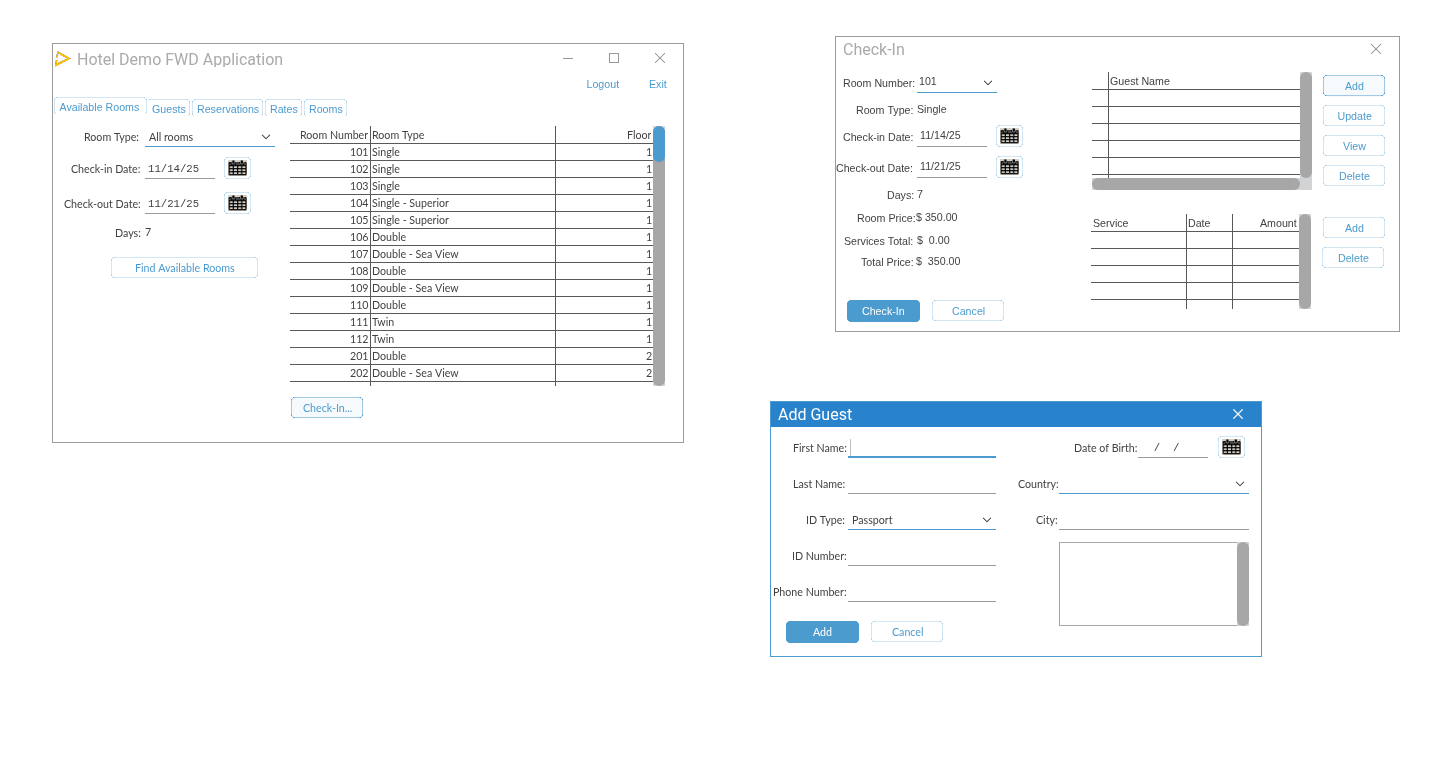
I was particularly invested into some bugs:
- [IMPROVEMENT]
drawRoundRectandfillRoundRectare using custom paths with Bezier curves on the corners. There is aroundRectin MDN docs that did a better job. The one in trunk is generating a weird AA artifact, whileroundRectis more precise. However, the color seems brighter than intended (most probably the AA still exists and brightens the color). - [BUG] After pressing a button, opening a dialog and closing it will let the button still drawn with "hover" state. Even hovering won't reset this state. I think that there is a bug on no emitting MOUSE EXIT event on the button after opening the dialog (you can see Check-In button in the main dialog - it stays like so even after returning)
- [BUG] The pressed color occurs on mouse up, not on mouse down. So the button is colored for pressed just for a very small time-frame after mouse up, but the whole intended UX is not there.
- [FEATURE] I attempted to make the browse header texts (labels) in bold, but this is not something allowed in OE. I am curious if we can extent FWD to allow the theme to at least force certain styles to text (e.g. intake a font and draw with its bold variant).
#3 Updated by Șerban Bursuc 11 months ago
[BUG] After pressing a button, opening a dialog and closing it will let the button still drawn with "hover" state. Even hovering won't reset this state. I think that there is a bug on no emitting MOUSE EXIT event on the button after opening > the dialog (you can see Check-In button in the main dialog - it stays like so even after returning)
[BUG] The pressed color occurs on mouse up, not on mouse down. So the button is colored for pressed just for a very small time-frame after mouse up, but the whole intended UX is not there.
There were some bug fixes similar for the scenarios described here in #9973. At least I am familiar with the hover and mouse exit one, I think it was this commit that fixed it #9973-76.
#5 Updated by Alexandru Lungu 11 months ago
- Related to Bug #10913: multiple tabs draw labels highlighted at the same time added
#6 Updated by Alexandru Lungu 11 months ago
- Related to Feature #10848: custom theme improvements added
#7 Updated by Alexandru Lungu 11 months ago
- Related to Support #10926: General clean-up of Theme added