Feature #3684
implement a web theme inspired by material design
100%
Related issues
History
#1 Updated by Eric Faulhaber almost 8 years ago
Currently, we have legacy-based Windows-like UI themes, but when placed in the context of an embedded web client, the legacy look and feel is out of place.
The idea is to create a more modern theme which is inspired by material design. Generally, we will prefer clean, simple, flat optics to 3D effects, though simple animation as is appropriate to material design principles is good. The latter may require some enhancement to the theme infrastructure.
The components we use for the embedded web client are primarily from https://material-components-web.appspot.com/. The legacy widgets under this theme should have a similar look and feel.
It is ok if the widget sizes do not match the legacy counterparts exactly, as this theme is not expected to match any legacy look and feel pixel-for-pixel. Also, we expect to use this the theme in conjunction with a more dynamic layout (e.g., see #3269), which should adjust for reasonable discrepancies in size.
The theme should leverage CSS for styles, with sensible, business-appropriate defaults.
#2 Updated by Greg Shah almost 8 years ago
Our current themes work for all GUI clients. I did not intend to make this enhanced theme only for the GUI embedded web clients. We can do so, but I think we may want a more generic approach that allows the more modern, flat look to be used in all our GUI clients (even Swing).
We've been thinking about the CSS skinning idea for quite a while (see #1826), though I had not documented specific details. We may want to separate this work from the enhanced/modern/material theme and make sure that the the skinning is done in a generic way. Although the CSS approach does not have to support Swing, I do think that it should be usable for more than just this one theme.
#3 Updated by Greg Shah almost 8 years ago
- Related to Feature #1826: GUI web client skinning support (look and feel control) via CSS added
#4 Updated by Greg Shah almost 8 years ago
Our embedded mode client uses the https://codyhouse.co/demo/multi-level-accordion-menu/index.html for menus. I don't prefer this approach in the theme itself. We used this instead of the popup menu from https://material-components-web.appspot.com/ because that menu did not support sub-menus. Visually, I prefer the http://www.material-ui.com/#/components/menu but we couldn't use it because it was written for NodeJS.
#5 Updated by Constantin Asofiei almost 8 years ago
In regards to CSS theme colors: we could just redefine the 4GL color-table from CSS values, via some dedicated API.
#6 Updated by Ovidiu Maxiniuc almost 8 years ago
Theme, probably not derived from any of the current themes. At least the final version, intermediary revisions will probably extend W10 in order to have a mockup of the application. There are a few of issues/notes I need to clarify:
- I understand that this will be a default theme for web clients only. I guess this will be configured in directory so nothing special in the new Theme implementation;
- The widgets from the example use a lot of animation. We are rendering them 'remotely' from the spawned client. We already have some performance issues with drawing. So I think a similar animation is out of question. The 'basic' animation you mention is just as we support today mouse hovering on widgets for Windows8 and Windows10;
- the sample widgets (and the current tendency due to high resolution tablet/phones) use a lot of space. They are really big for an old-fashioned screen with 1280x1024. Our widgets mimic the 4GL widgets that keep the Windows95 compatibility - they are small, the goal when they were designed was to fit a 800x600 or even smaller computer screens. The new Theme will scale the drawing to available space but this need to be specified somewhere. The
Themeinterface do not have such leverage/API because the dimension of the widgets is computed by themselves, individually; - the
sensible, business-appropriate defaultsyou mention need to be brought from web client to Theme itself using some API. I am thinking of a basic palette of primary colours that will be used for drawing the widgets - maximum 4 colours: background (white), normal (green), active/highlighted (orange) and disabled (grey). Maybe one more additional colour for foreground text (black). Shades of these colour (lighter/darker) may be computed, as needed. Of course, if the ABL programmer chooses a colour at runtime, that one will prevail, as in current themes.
#7 Updated by Greg Shah almost 8 years ago
I understand that this will be a default theme for web clients only.
It really depends on the result. If we can make the virtual desktop mode look more modern, this would be of great value. And it would seem that the same result could be used in Swing too.
#8 Updated by Ovidiu Maxiniuc almost 8 years ago
Constantin,
Where can I find details on how to set-up the embedded web environment for the project so that I can see the existing work. I've seen some of your recent screen-shots but I haven't run this kind of clients lately.
#9 Updated by Eric Faulhaber almost 8 years ago
Unless there is a high risk of regression, please add this implementation to task branch 3670a.
#10 Updated by Ovidiu Maxiniuc almost 8 years ago
Eric Faulhaber wrote:
Unless there is a high risk of regression, please add this implementation to task branch 3670a.
I don't see any risk. The changes are isolated to new Theme class and its dependencies, as additions. As long as the new class is not configured to be loaded in the client, there is no chance that the new code to be executed. Beside that we have the choice to deploy it as a separate jar.
BTW, is it OK to name the new class MaterialTheme?
#11 Updated by Eric Faulhaber almost 8 years ago
Ovidiu Maxiniuc wrote:
BTW, is it OK to name the new class
MaterialTheme?
Yes.
#12 Updated by Ovidiu Maxiniuc almost 8 years ago
- painting using the width of the line of 2 pixels. It seems to me that we do not have support for such drawing yet;
- for radio buttons I need to paint circles/ellipses. The
GuiDrivercompletely lacks support for these shapes.
#13 Updated by Eric Faulhaber almost 8 years ago
Ovidiu Maxiniuc wrote:
for radio buttons I need to paint circles/ellipses. The
GuiDrivercompletely lacks support for these shapes.
I don't understand; we have circular radio buttons in other themes (e.g., Win8). Am I missing something?
#14 Updated by Ovidiu Maxiniuc almost 8 years ago
- Status changed from New to WIP
Yes, we are drawing them as circles, but they are actually tiny images.
I could do the same here, but then they would not be 'colorable'. The resources from Windows themes are keeping their colors. For this theme, the colors are inherited from web page (not yet implemented) so they cannot be pre-rendered.
I don't think that adding a new drawing primitive is an issue. It also does not require testing with old app components. I will add them as needed.
Btw, I committed a 1st revision r11288 in 3670a.
#15 Updated by Greg Shah almost 8 years ago
Yes, feel free to add primitives to the GUI driver as needed.
#16 Updated by Constantin Asofiei almost 8 years ago
Ovidiu Maxiniuc wrote:
Btw, I committed a 1st revision r11288 in 3670a.
You've added a src2/ folder - is this temporary?
#17 Updated by Ovidiu Maxiniuc almost 8 years ago
- File Screen-Shot-001.png added
Constantin Asofiei wrote:
Yes, that was my idea. The code is not compilable so I did not want to broke the build of the project. If you want to see the result, you can add the new folder as a source folder to you builder, and comment out the lines with compile errors. Or, see the attached image in #3552#note-211Ovidiu Maxiniuc wrote:
Btw, I committed a 1st revision r11288 in 3670a.
You've added a
src2/folder - is this temporary?
The following things are important:
- only buttons and checkboxes are implemented;
- buttons (two enabled, one disabled) have UPPERCASE text - as seen in theme demo, but this means sometime the text will not fit, so probably we will keep the original casing;
- the font is the one set in widget configuration, I am not aware if we can switch to the font used in the rest of the page;
- as pointed above, the line width is, at least to say, inconsistent. The checkboxes (two checked two unchecked) look awful to me. The unchecked should have been drawn with double line but two sides are drawin with single line. The check mark (white) also should have been thicker, but it is using a single pixel line width;
- I could not find some samples of how scrollbars should look in this theme. I guess the webpage will use the native scrolls of the browse.
#18 Updated by Ovidiu Maxiniuc almost 8 years ago
- File deleted (
Screen-Shot-001.png)
#19 Updated by Greg Shah almost 8 years ago
Guidelines for Material Design:
I've seen some examples of scrollbars:
https://mdbootstrap.com/javascript/smooth-scroll/#material
https://github.com/google/material-design-lite/issues/3609
https://material.io/design/components/menus.html#behavior
The basic idea: get rid of the 3D, get rid of the borders, make things flat and smooth. The arrow buttons can remain but are also flattened.
#20 Updated by Ovidiu Maxiniuc almost 8 years ago
What's new:
- added ellipses drawing primitive (not yet tested on Swing) - I had some hard time with javascript side but I end up with two solutions here;
- scrolls and radio button are now rendered with new palette;
- fixed issues found with checkboxes and buttons.
#21 Updated by Ovidiu Maxiniuc almost 8 years ago
What's new:
- improved browse drawing;
- added support for drawing fill-ins;
- fixed
brightermethod; - added default color/fonts. The font were forced to be a bit bigger, but I see no effect on screen;
- added javadocs for all method implemented;
- I added an API for checking of flat themes, please review that part.
What need to be done.
The MaterialTheme contains all API from Theme interface, but the methods were commented out and I used the Windows10 theme as base class in order to have it working. As support was added for various widgets, the methods were uncommented. There are about 50 more methods that need implementation so that the Theme to be standalone. These include windows and their caption buttons, statusbar, alertboxes and other widgets that may not need for this particular theme. What is important to add is support for drawing: comboboxes, scrolling lists, sliders.
Note: the theme uses Windows10 binary resources so probably these should be also redesigned in accordance with the theme patterns.
I will try to follow this task the next two weeks and, when asked, I will answer any direct questions asked here.
LE:
At TO BE DONE list I need to add the support for configuring the new Theme with a palette of 5 colors from the web-page. The implementation is quite simple in Theme, just need to update the pal field with a set of 5 colors. The problem is communication. I tried to do it but I didn't find a solution to communicate the right direction.
#22 Updated by Ovidiu Maxiniuc almost 8 years ago
I merged the 3684a branch into 3600e. Please let me know your opinions on how it looks.
As usual, to have the Theme loaded in client you need to set it in the directory (for example /server/default/theme:name = "com.goldencode.p2j.ui.client.gui.theme.MaterialTheme").
I have one problem, though.
As noted above, I implemented a method for querying the basic web palette from JS. I added a new message 0xAF that is used to sent the query when the Theme is initialized and JS should respond with same message. From my tests it does. Apparently, that the moment is not very well chosen, because the client seems to hang. I need this set of color quite soon - in constructor would be the best but I could also wait for some external notification.
The implementation can be seen in 3600e/11288 (you need to set palRead to false to have the message sent). Does somebody has any idea why it does not work?
#23 Updated by Greg Shah almost 8 years ago
Sergey: Can you please look at this web client palette message issue?
#24 Updated by Greg Shah almost 8 years ago
- Related to Feature #2676: implement the equivalent to configurable support for a windows theme added
#25 Updated by Sergey Ivanovskiy almost 8 years ago
I will work on this issue as a part of #2673.
#26 Updated by Eric Faulhaber almost 8 years ago
Ovidiu, the material theme looks really great. Nice job! I have a few questions and a suggested change:
- How easy is it to customize the color scheme? It currently seems to be tailored to one particular brand. I think the orange works for that case, but it might not be the best default for all business applications.
- I think we should not uppercase all the button text. While I like the aesthetic generally, it causes problems with some text being clipped because of the larger size of all caps. Also, we should not assume it always is ok to change the case; there may be some uses where meaning is attached to the case.
- What is the significance of a button being orange as opposed to blue?
#27 Updated by Eric Faulhaber almost 8 years ago
I also just noticed that the I-beam cursor seems to get lost when tabbing between fill-ins. The highlight/underline of the fill-in with focus is a nice touch, btw.
#28 Updated by Ovidiu Maxiniuc almost 8 years ago
Eric Faulhaber wrote:
Ovidiu, the material theme looks really great. Nice job! I have a few questions and a suggested change:
- How easy is it to customize the color scheme? It currently seems to be tailored to one particular brand. I think the orange works for that case, but it might not be the best default for all business applications.
As you notice, all rendering is done with shades of the basic 5 color palette and some inherited colors, to keep the background continuity. This palette can be overwritten at any time just by calling updatePalette. But there is only known outstanding issue. The client blocks because of communication with JS (locked in the notification response in GuiWebSocket:4118).
- I think we should not uppercase all the button text. While I like the aesthetic generally, it causes problems with some text being clipped because of the larger size of all caps. Also, we should not assume it always is ok to change the case; there may be some uses where meaning is attached to the case.
I tried to keep the look of the theme from reference. I will revert it.
- What is the significance of a button being orange as opposed to blue?
The orange button is the default one - that respond to ENTER key press.
Note: I don't know if you noticed the focused button. Instead of standard dotted rectangle, the focused button is a bit lighter, regardless it is the default or not. This is more visible when TAB-cycling. If you consider the color difference is not enough we can make it a bit more brighter.
- I also just noticed that the I-beam cursor seems to get lost when tabbing between fill-ins.
I don't think this is caused by the Material theme, the cursor was kept from super class/es. But I will investigate, though.
The highlight/underline of the fill-in with focus is a nice touch, btw.
Thanks. I cannot assume credit for the idea; also from reference. There is a problem when the fill-ins are too close to each to another: since the border is not fully drawn, one cannot distinct multiple fill-ins stacked horizontally. If they are stacked vertically and overlapped for 2 pixels, the underline will become invisible.
#29 Updated by Sergey Ivanovskiy almost 8 years ago
Ovidiu, please review the committed 11324. It seems that the root cause was that the web client was waiting for the palette that should be parsed first and then should be written into the received message map receivedMessages.
Does requesting 5-color palette from the JS web client need for the embedded mode to get the palette from the external web application that controls look and feel of the embedded client?
#30 Updated by Ovidiu Maxiniuc almost 8 years ago
Sergey Ivanovskiy wrote:
Ovidiu, please review the committed 11324. It seems that the root cause was that the web client was waiting for the palette that should be parsed first and then should be written into the received message map
receivedMessages.
Thanks, that did the trick. I was not aware of this handling and I was failing to track the JS response at some point.
Does requesting 5-color palette from the JS web client need for the embedded mode to get the palette from the external web application that controls look and feel of the embedded client?
Normally, MaterialTheme should obtain the palette from the external web application when it is instantiated.
However, I think, it would be better if external web application could initiate the palette change, too. If the current theme of FWD can be customised with the palette, it should be used otherwise ignored. I have no clue if this is possible.
#31 Updated by Sergey Ivanovskiy almost 8 years ago
- File EstimateFoldingBrwsEst_material_theme.png added
#32 Updated by Sergey Ivanovskiy almost 8 years ago
- File deleted (
EstimateFoldingBrwsEst_material_theme.png)
#33 Updated by Sergey Ivanovskiy almost 8 years ago
It can be observed with the Material theme that the virtual desktop looks differently not according to the selected theme. The virtual desktop doesn't change its look and feel when the theme is changed. It seems this task has been missed.
#34 Updated by Greg Shah almost 8 years ago
Can you show what you mean using a screen capture from Hotel GUI? What specifically needs to be done and what do you suggest as a solution?
#35 Updated by Ovidiu Maxiniuc almost 8 years ago
Greg Shah wrote:
Can you show what you mean using a screen capture from Hotel GUI? What specifically needs to be done and what do you suggest as a solution?
I got Sergey's screen-shot. There is an 1-pixel offset at the 3 column so the horizontal separators are 'broken'. I will investigate that later today.
#36 Updated by Ovidiu Maxiniuc almost 8 years ago
The problem occurs when there are both fixed and scrollable columns in a browse. The fixed ones are drawn with a (+1, +1) offset. However, the code is the same. I am a bit puzzled here.
#37 Updated by Ovidiu Maxiniuc almost 8 years ago
Ovidiu Maxiniuc wrote:
The problem occurs when there are both fixed and scrollable columns in a browse. The fixed ones are drawn with a (+1, +1) offset. However, the code is the same. I am a bit puzzled here.
The offset was given by the fact that the set of fixed columns assumed a border of 1px around the browse widget. The Material theme is flat so no border exists.
Committed in revision 11336 of 3600e.
#38 Updated by Sergey Ivanovskiy almost 8 years ago
- File hotel_gui_material.png added
- File hotel_gui_windows_8.png added
- File hotel_gui_windows_10.png added
- File hotel_gui_windows_classic.png added
Greg Shah wrote:
Can you show what you mean using a screen capture from Hotel GUI? What specifically needs to be done and what do you suggest as a solution?
Added Hotel Gui screens with available UI themes.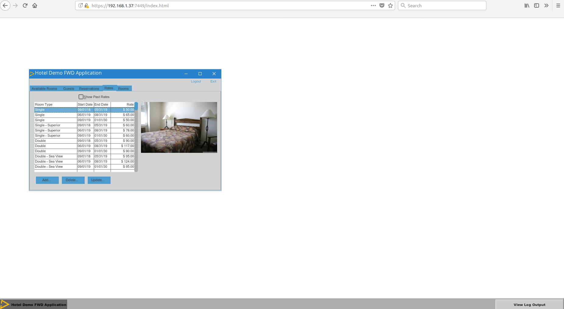
I have no solution but it seems the task bar style and its buttons style can be changed to flat with new background and foreground colour schema that corresponds to the selected UI theme.
#39 Updated by Greg Shah almost 8 years ago
but it seems the task bar style and its buttons style can be changed to flat with new background and foreground colour schema that corresponds to the selected UI theme.
I agree that would be optimal. I think that work should be added to #2673. But I do see this one as a bit tricky because the web client has no theme implementation, so it will probably require some theme-specific taskbar code.
#40 Updated by Eric Faulhaber almost 8 years ago
Ovidiu, is there anything left to do from the original goals of implementing the material theme, or can we close this task? We can address any further defects or enhancements in separate issues.
#41 Updated by Ovidiu Maxiniuc almost 8 years ago
The only remaining issue is the customization. For the moment the implementation is hardcoded, more like "this way you can set the palette from JS side".
There is more details in my note-30, above. I think the eventual refinement of this can be done in #2673, so this tracker can be closed.
#42 Updated by Greg Shah about 7 years ago
- Status changed from WIP to Closed
- % Done changed from 0 to 100